While reading a news article I came across a US state cloropleth that piqued my curiosity.
An economic news article on state unemployment rates at The New Republic included a state level map with a two color scale and tooltips. As always when I see a new chart that I like I look for two things to steal; the data and the method used to make the chart.
In this case I was in luck. The embedded chart included links for both the method used and the data (great features of Datawrapper).
Datawrapper.de is a set of open source visual analytics tools (mostly Javascript from what I've seen) integrated into an easy to use UI. For those of us still learning D3.js this is a great way to build beautiful, interactive charts with the style and capabilities of the D3 style graphics which are used by many online publications and bloggers.
State level maps (Maps still in Beta at time of writing) are really easy and fun to create. To build you simply start by uploading or pasting in your data. I was able to simply paste in two columns of data, state abbreviation and value. Using R this might have taken me fifteen or twenty minutes or so, at Datawrapper this only took five
I took another stab at this data, trying out one of the line chart templates provided. Here I wanted to try to mimic (substance not style) one of my most favorite data tools, FRED:
Following similar steps to the state US map above I simply pasted in the time series data from FRED and moved through the Datawrapper wizard. I simply selected line chart then updated a few options to better mimic FRED (sadly the iconic recession shading is not available natively, or grid lines). In some ways the result is even more aesthetically pleasing, and could be a nice easy addition to a blog post or article
Showing posts with label Visual analytics. Show all posts
Showing posts with label Visual analytics. Show all posts
Tuesday, April 22, 2014


Friday, April 11, 2014
GeoGraphing with R; Part 4: Adding intensity to the county Red/Blue Map
Today I took the Red/Blue exercise from the last post a bit further. I'm a big advocate for the power of the subtle use of multiple indicators in a single chart and I thought I'd try this with the county level election graphs from the last post. In my experience the usability of chart peaks at three or so data points per visual. Any more than this and there is a real risk of boredom or confusion for the reader. The election maps in the last post had two layers (geography and winner), earlier I tried out expanding the second layer to include a measure of intensity.

Luckily R includes a package that makes this quite simple. The scales package includes the very useful alpha() function which transforms a color value using some scalar modifier. To achieve this in the scripts I used for the last post I simply had to create some scalar and use that to modify the existing color scheme.
This only adds two additional lines to the earlier scripts:
Created by Pretty R at inside-R.org
I really think this helps add another dimension to the chart, answering an inevitable question that the reader might have.
There are a couple of issues with this methodology however, since the observed winning percentage values are so centered around certain values. In mid fifties for many counties, 2012 range was 46.2% (Eastford county Connecticut) to 95.9% (King county Texas). This causes a washout effect on the colors in the chart. A non-linear scaling using a log scale or binned color mapping could help with this.
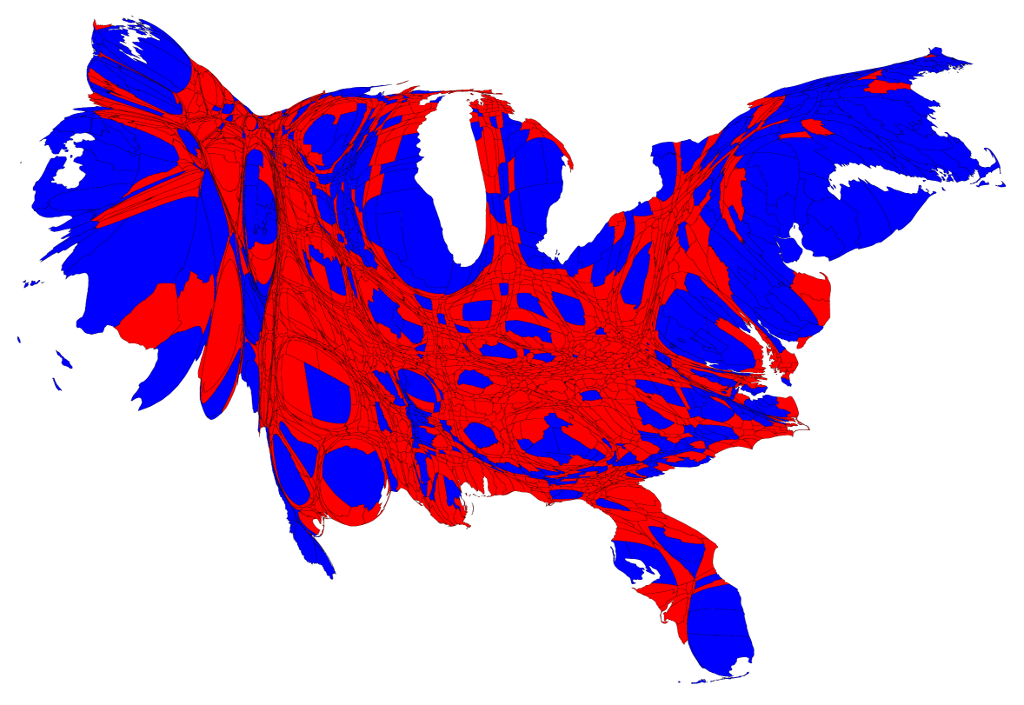
Additionally, some measure of population size could be added to improve the readability of the chart. Election maps (as with most US level value maps) suffer from the cognitive dissonance of a seemingly uniform land distribution with a disparate population distribution. I was really influenced by Mark Newmans' fun take on election mapping. The cartographs he posted are especially interesting, I hope to create those in R sometime. I love the way that the population weighted cartograph allows the reader to intuit the average value from an otherwise misleading two color heatmap.
Luckily R includes a package that makes this quite simple. The scales package includes the very useful alpha() function which transforms a color value using some scalar modifier. To achieve this in the scripts I used for the last post I simply had to create some scalar and use that to modify the existing color scheme.
This only adds two additional lines to the earlier scripts:
#Calculate winning percentage to use for shading
elect12$WinPct <- elect12$Win_Votes/elect12$TOTAL.VOTES.CAST
#Create transparent colors using scales package
elect12$alphaCol <- alpha(elect12$col,elect12$WinPct)
#Match colors to county.FIPS positions
I really think this helps add another dimension to the chart, answering an inevitable question that the reader might have.
There are a couple of issues with this methodology however, since the observed winning percentage values are so centered around certain values. In mid fifties for many counties, 2012 range was 46.2% (Eastford county Connecticut) to 95.9% (King county Texas). This causes a washout effect on the colors in the chart. A non-linear scaling using a log scale or binned color mapping could help with this.
Additionally, some measure of population size could be added to improve the readability of the chart. Election maps (as with most US level value maps) suffer from the cognitive dissonance of a seemingly uniform land distribution with a disparate population distribution. I was really influenced by Mark Newmans' fun take on election mapping. The cartographs he posted are especially interesting, I hope to create those in R sometime. I love the way that the population weighted cartograph allows the reader to intuit the average value from an otherwise misleading two color heatmap.
Thursday, April 10, 2014
GeoGraphing with R; Part 4: County Level Presidential Election Results

I've always loved US county level mapping because it provides enough detail to give an impression of complexity but retains a level of quick readability. I thought I'd try this out in R out a with a cliche but hopefully appealing set of charts. While I'm not particularly interested in political science I've always loved the graphics that define it. There is a kind of pop art beauty in the Red-Blue charts we're all used to seeing, and I thought I'd try to mimic those using R.
First, the data had to be located. As always, it's a little more difficult securing county level data than other metrics. The basic problem for election results county data is that while the data is well sourced at a state government level the county data is not easily found for all states in one place in an accessible way. I found a few great resources when searching for this data, and I ended up using two sources which seemed to be authorities on the subject for both the 2008 and 2012 presidential elections.
2008
For the 2008 election I used a file from Ducky/Webfoot, a blogger who cleaned up a contemporary fileset provided by USA Today. Since this set was already well cleaned there was little to do but read.csv() and code.
2012
Here I relied on a set provided by the Guardian which was referenced by some interesting blog posts on the subject. The Guardian provides the data in .xls or Google fusion table format. I chose to use the .xls file, which I cleaned somewhat and re-saved as a .csv.
I began by making sure the county FIPS codes lined up with those in the R maps package. It turned out that both sets were well populated with FIPS, but 2012 seemed to be missing some detail for Alaska (here I imputed a Romney win for the 10 or so states without data) and the 2008 set needed a transformation to create the five digit county FIPS code (state level multiplied by 1000 + county)
After reading in the .csv's I assigned a color value (#A12830 and #003A6F two of my favorite hex colors) to each FIPS based on the winning candidate (classic Red and Blue, no surprises here). This allows me to do a little trick later and quickly assign each county a color. I then assigned these colors and the Candidate names to lists to help create a legend later on:
Next I created a list of colors matched and sorted on county from the county.fips data in the maps package:
elect12colors <- elect12$col [match(cnty.fips, elect12$FIPS.Code)]
After this we're ready to build the map. Here I used the png device because I wanted to make a really big zoomable image. The map() function here is pretty straightforward but I'll note that it is the "matched" color list that I'm using to assign the Red/Blue to the map in order to separate the color mapping outside of the map() function.

2008 Election R script
#R script for plotting the county level Presidential popular vote results of 2008#Read in pre-formatted csv with binary M/O values for "Won"
elect08 <- read.csv("prez2008.csv")
#Assign appropriate color to winning candidate#"#A12830" is a dark red, "#003A6F" a darker blue
elect08$col <- ifelse(elect08$Won=="M","#A12830","#003A6F")
#Transform for FIPS from 2008 data
elect08$newfips <- (elect08$State.FIPS*1000)+elect08$FIPS

#Create lists for legend
colorsElect = c("#A12830","#003A6F")
leg <- c("McCain", "Obama")
#Match colors to county.FIPS positions
elect08colors <- elect08$col [match(cnty.fips, elect08$newfips)]
#Map values using standard map() function, output to png devicepng("elect08.png",width = 3000, height = 1920, units = "px")
map("county", col = elect08colors, fill = TRUE, resolution = 0,
    lty = 0, projection = "polyconic")#Add white borders for readability
map("county", col = "white", fill = FALSE, add = TRUE, lty = 1, lwd = 0.2,
    projection="polyconic")title("2008 Presidential Election Results by County", cex.lab=5, cex.axis=5, cex.main=5, cex.sub=5)box()legend("bottomright", leg, horiz = FALSE, fill = colorsElect, cex = 4)dev.off()
2012 Election Map R Script
#R script for plotting the county level Presidential popular vote results of 2012#Read in pre-formatted csv with binary R/O values for "Won"
elect12 <- read.csv("2012_Elect.csv")
#Assign appropriate color to winning candidate#"#A12830" is a dark red, "#003A6F" a darker blue
elect12$col <- ifelse(elect12$Won=="O","#003A6F","#A12830")

#Create lists for legend
colorsElect = c("#003A6F","#A12830")
leg <- c("Obama", "Romney")
#Match colors to county.FIPS positions
elect12colors <- elect12$col [match(cnty.fips, elect12$FIPS.Code)]
#Map values using standard map() function, output to png devicepng("elect12.png",width = 3000, height = 1920, units = "px")
map("county", col = elect12colors, fill = TRUE, resolution = 0,
    lty = 0, projection = "polyconic")#Add white borders for readability
map("county", col = "white", fill = FALSE, add = TRUE, lty = 1, lwd = 0.2,
    projection="polyconic")title("2012 Presidential Election Results by County", cex.lab=5, cex.axis=5, cex.main=5, cex.sub=5)box()legend("bottomright", leg, horiz = FALSE, fill = colorsElect, cex = 4)dev.off()
Monday, January 27, 2014
GeoGraphing with R; Part 3: Animation
I've found a few methods of doing this, almost all of which use ImageMagick or GraphicsMagick, callable tools to convert images files into gifs, ffmepgs, mpgs etc.
Most of the examples I've found involve calling the "convert" command (a PATH reference to ImageMagick or GraphicsMagick) within a function of the animation package.
A few of these make use of the saveGIF() function available from the animation library. I like the intuitive nature of this function, but I found that I wasn't able to control the ImageMagick conversion as well as I'd like. Using ImageMagick directly from the command line along with some settings tweaks gave me more nuanced control of the GIF creation.
I followed a process of creating the images first (PNGs created through a controlled loop, see Part 2) then calling ImageMagick's convert function directly from the command line using a command like:
C:\Users\Erich\Documents\Plots\State UNMP>convert -delay 100 *.png "UNMP2012+.gif"
At work I took a slightly different tack, and used a different external conversion program, PhotoScape. THe PhotoScape GUI was easy to use, but not as hack-y as ImageMagick.

Finding the right delay is key; I've found 80ms works well for many charts
Sunday, January 26, 2014
GeoGraphing with R; Part2: US State Heatmaps
The second geographical chart project I'll show is a classic. In a national business it's often important to know the economic health of a region given different economic indicator values. This logic uses a two color heatmap scheme for some intensity level visual feedback.This is another project I've developed at work and modified here to use public data.
The quantmod financial modeling library is the main source for this project. I really like the design of this library. The quantmod library features quick access to the most common sources of financial time series data (Google finance, Yahoo stocks, and FRED). There are some great built in functions, a few of which I make use of below. quantmod also has the added benefit of allowing you to trick coworkers into thinking you had a Bloomberg terminal installed overnight:

Created by Pretty R at inside-R.org
The second function plots the state data onto a US map. I borrowed much of the map plotting logic from Oscar Perpinan which I found from a StackOverflow question. This function could be used with other data, just note that I have used the names from the stFRED function for the plotted dataset.
Created by Pretty R at inside-R.org
As seen in the code, I have included some limited date subsetting funcationality and the resulting plots are saved for each available date. This presents some possible problems if a very large data range is selected, but this iterative function will come in handy in part three of this series, animation.


The quantmod financial modeling library is the main source for this project. I really like the design of this library. The quantmod library features quick access to the most common sources of financial time series data (Google finance, Yahoo stocks, and FRED). There are some great built in functions, a few of which I make use of below. quantmod also has the added benefit of allowing you to trick coworkers into thinking you had a Bloomberg terminal installed overnight:
Great looking chart in three commands:
library(quantmod)
getSymbols('GOOG')
lineChart(Cl(GOOG['2011::']))
This project uses data from the St. Louis Federal Reserve's FRED repository. I've written about my love for this public data before and using it with the quantmod library in R is even more convenient.
To create the heatmaps, I separated the project into two functions; the first creates a standardized data frame consisting of the time series data for each state, the second plots the state level data against a US state boundary map.
I've dubbed the first function "stFRED". This function loops through each state using the built in state.abb data. With each loop columns for date (from the quantmod xts index) and state name (from state.abb) are added to a data.frame creating a single standardized set structure. After every state is added ldply is called to combine all sets.
#The stFRED function is built using the quantmod library to assign all US state level economic data to a single data frame
#I have chosen to for loop through each state in order to make use of the auto.assign=FALSE functionality
#which allows the printing each set instead of assigning it to separate sets
stFRED <- function(econ,begin="",ending=""){
  require(quantmod)
# The default state abbreviation set is used for the loop length and quantmod query
  stDat <- lapply(state.abb, function(.state){
  input <- getSymbols(paste(.state,econ,sep=""),src="FRED", auto.assign=FALSE)
# Here I use the very effective subset function for the quantmod xts sets, using the variables begin and ending to subset
  input <- input[paste(begin,'::',ending,sep="")]
# Converting the xts set to a data frame makes the data easier to manipulate for charting and other functions.
# This step assigns a date value to the index of the xts
  input <- data.frame(econ_month=index(input),coredata(input))
# Since each state's indicator data includes a unique name ("VA...","GA...") I normalize them to one here
  colnames(input)[2]<-"ind_value"
# In order to separate the data later I include a variable for state name
  input$St <- .state
  input
  })
# After returning each state dataset, I add them together using the very helpful ldply function
require(plyr)
result <- ldply(stDat,data.frame)
  result
}
The second function plots the state data onto a US map. I borrowed much of the map plotting logic from Oscar Perpinan which I found from a StackOverflow question. This function could be used with other data, just note that I have used the names from the stFRED function for the plotted dataset.
#stFREDPlot creates a US state heatmap based on a state level data frame.
#While any state level set may be used, I have written this function to complement the stFRED function
#which produces a data frame which fits this function well.
stFREDPlot <- function(ds,nm=ptitle,ptitle=nm,begin=NULL, ending=NULL) {
# The libraries needed here are needed for the US state boundary mapping feature
  require(maps)
  require(maptools)
  require(mapproj)
  require(sp)
  require(plotrix)
  require(rgeos)
# To provide some default values for the begin and ending variables, I have set these variables to the minimum and maximum dates (full range)
# of the dataset.  This can be used for one or both, allowing partial subsets.
  if ( is.null(begin) ) { begin<-min(ds$econ_month)}
  if ( is.null(ending) ) { ending<-max(ds$econ_month)}
  subds <- ds[ds$econ_month >= as.Date(begin) & ds$econ_month <= as.Date(ending),]
#The econSnap set is used for quick reference of the unique dates used
  econSnap <- sort(unique(as.Date(subds$econ_month)))
#The dir.create function is used to create a folder to store the potentially many plot images created.
  if (is.null(nm) ) { print("Please enter a name or chart title") }
  dir <- paste("~//Plots//",nm,"//",sep="")
  dir.create(file.path(dir), showWarnings = FALSE)
#The variable i is used to reference the correct date in the econSnap set.
  i <- 0
  for (n in econSnap) {
    plot.new()
    i <- i+1
#   Dataset limited to iterated reference date.
    dataf <- data.frame(subds[subds$econ_month == n,])

#   Much of this plotting logic built from tutorial found here: http://stackoverflow.com/questions/8537727/create-a-heatmap-of-usa-with-state-abbreviations-and-characteristic-frequency-in
#   Credit: StackOverflow user http://stackoverflow.com/users/964866/oscar-perpinan
    dataf$states <- tolower(state.name[match(dataf$St,  state.abb)])
    mapUSA <- map('state',  fill = TRUE,  plot = FALSE)
    nms <- sapply(strsplit(mapUSA$names,  ':'),  function(x)x[1])
    USApolygons <- map2SpatialPolygons(mapUSA,  IDs = nms,  CRS('+proj=longlat'))

    idx <- match(unique(nms),  dataf$states)
    dat2 <- data.frame(value = dataf$ind_value[idx], match(unique(nms),  dataf$states))
    row.names(dat2) <- unique(nms)

    USAsp <- SpatialPolygonsDataFrame(USApolygons,  data = dat2)
    s = spplot(USAsp['value'],   col.regions = rainbow(100, start = 4/6, end = 1), main = paste(ptitle, ":  ", format(econSnap[i], format="%B %Y"),sep=""), colorkey=list(space='bottom'))
#   Status feedback given to user representing which date's US chart has been created.
 print(format(econSnap[i], format="%B %Y"))
#   Plot saved as png.  Format chosen for malleability  in creating gif's and other manipulation
    png(filename=paste(dir,"//Map",substr(econSnap[i],1,7),".png",sep=""))
    print(s)
    dev.off()
#   Dataset cleanup
    rm(dataf)
    rm(dat2)
  }
}
As seen in the code, I have included some limited date subsetting funcationality and the resulting plots are saved for each available date. This presents some possible problems if a very large data range is selected, but this iterative function will come in handy in part three of this series, animation.
Wednesday, January 22, 2014
GeoGraphing with R; Part 1: Zipcode Mapping
I'd like to share some graphing work I've done with the R programming language. I have been interested in R for a few years now, and have enjoyed the extremely intuitive platform it provides for data analysis. Although I don't make much use of the powerful statistical tools R provides, I've found that this is the charm of R. It provides a platform for any use you could need, with an intuitive interface like Python. I keep R on my personal Ubuntu and Windows machines, use it at work, and have even installed R on my Raspberry Pis
I am a big fan of the RStudio IDE which provides some editing and data/file management services to the ultilitarian basic R GUI. I have also test similar code on a Raspberry Pi, which installs with a simple call to apt-get.
After seeing a presentation of some of the geographical presentation features of Tableau (GIS-lite within their visual analytics platform) I became inspired to experiment with mapping visuals, for free.
Using the wonderful wealth of user packages, I was able to get started on this quickly using some tutorials and documentation I found. I am especially in debt to Jeffrey Breen, the creator of the zipcode package and whose tutorial I found immensely helpful in creating this particular chart. This charting program is built around the plotting of latitude and longitude points against a contiguous United States map defined by state borders. Since the coordinates in each set is sympathetic, the matching between the borders and points is exact.
This particular chart is a version of a project I created for work, plotting the locations of bank branches for the top five banks by number of branches. In an era of thin branch banking, deep networks of brick and mortar branches aren't always considered key to retail banking success, but this type of analysis is still useful. This program is based on the publicly available branch location data from the FDIC downloaded as csv filess and parsed by R into data.frame objects. I have yet to find a public API for this data, bonus points to anyone who has.
The code below makes use of the zipcode package mentioned above as well as the ever useful ggplot2 graphing library. This is ready to run on any R platform with these packages installed.
Created by Pretty R at inside-R.org
Following the creation of this plot I usually use the ggplot2 ggsave feature to save the plot to an image file:
ggsave("branches5.png", plot=g)
The resulting plot:

As seen with the simplicity of the merge statement, you could substitute nearly any zipcode based data. Other charts I've created have included asset locations and temperature data.
As a preview, the next R GeoGraphing Post will focus on state level mapping data, and includes some animation tricks.
I am a big fan of the RStudio IDE which provides some editing and data/file management services to the ultilitarian basic R GUI. I have also test similar code on a Raspberry Pi, which installs with a simple call to apt-get.
After seeing a presentation of some of the geographical presentation features of Tableau (GIS-lite within their visual analytics platform) I became inspired to experiment with mapping visuals, for free.
Using the wonderful wealth of user packages, I was able to get started on this quickly using some tutorials and documentation I found. I am especially in debt to Jeffrey Breen, the creator of the zipcode package and whose tutorial I found immensely helpful in creating this particular chart. This charting program is built around the plotting of latitude and longitude points against a contiguous United States map defined by state borders. Since the coordinates in each set is sympathetic, the matching between the borders and points is exact.
This particular chart is a version of a project I created for work, plotting the locations of bank branches for the top five banks by number of branches. In an era of thin branch banking, deep networks of brick and mortar branches aren't always considered key to retail banking success, but this type of analysis is still useful. This program is based on the publicly available branch location data from the FDIC downloaded as csv filess and parsed by R into data.frame objects. I have yet to find a public API for this data, bonus points to anyone who has.
The code below makes use of the zipcode package mentioned above as well as the ever useful ggplot2 graphing library. This is ready to run on any R platform with these packages installed.
#Install needed libraries (Note that zipcode is used for a dataset)
library(zipcode)
library(ggplot2)
data(zipcode)

#Read and format .csv's downloaded from the FDIC
#Source http://research.fdic.gov/bankfind/
#csv's were renamed to the stock ticker of each bank but are otherwise unchanged
#The raw csv's include 7 rows of metadata, this is removed allowing row 8 to be used as headers
#Since Zip and Bank are all we care about, for now other headers are ignored
#Bank name is added to allow aggregation by entity later
#I've created a quick function for importing the data
readBank <- function(filename) {
  bank <- read.csv(paste(filename,".csv",sep=""), header=TRUE,skip=7)
  bank$Bank <- filename
  bank
}
WFC <- readBank("WFC")
JPM <- readBank("JPM")
BAC <- readBank("BAC")
USB <- readBank("USB")
PNC <- readBank("PNC")

#Concatenate bank files together
top5 <- rbind(WFC,JPM, BAC, USB, PNC)
#merge five bank set with zipcode to make mapping possible
top5Zip <- merge(zipcode,top5, by.x= "zip",by.y ="Zip" )

#Much of the following has been taken from Jeffrey Breen at http://jeffreybreen.wordpress.com/2011/01/05/cran-zipcode/
#Begin mapping function.  Colors denote bank names.  "size" is increased to enhance the final plot
g <- ggplot(data=top5Zip) + geom_point(aes(x=longitude, y=latitude, colour=Bank), size = 1.25)

#Simplify display and limit to the "lower 48"
#Some banks have Alaska branches (specifically Wells Fargo in this data), this is included, but ignored by the ggplot
g <- g + theme_bw() + scale_x_continuous(limits = c(-125,-66), breaks = NULL)
g <- g + scale_y_continuous(limits = c(25,50), breaks = NULL)

#Don't need axis labels
g <- g + labs(x=NULL, y=NULL)
g <- g + borders("state", colour="black", alpha=0.5)
g <- g + scale_color_brewer(palette = "Set1")
#Arbitrary title
g <- g + ggtitle("Top Five Banks by Number of Branches") + theme(plot.title = element_text(lineheight=.8, face="bold"))
g <- g+ theme(legend.direction = "horizontal", legend.position = "bottom", legend.box = "vertical")
g
Following the creation of this plot I usually use the ggplot2 ggsave feature to save the plot to an image file:
ggsave("branches5.png", plot=g)
The resulting plot:
As seen with the simplicity of the merge statement, you could substitute nearly any zipcode based data. Other charts I've created have included asset locations and temperature data.
As a preview, the next R GeoGraphing Post will focus on state level mapping data, and includes some animation tricks.
Subscribe to:
Posts (Atom)